 Book Traveling Thursdays is a weekly meme for book bloggers which celebrates the distance a book travels by way of its covers. I’ve only recently discovered this meme thanks to the blog of the co-creator, Catia (the other being Danielle) and the Goodreads group, but I love the concept of it – particularly because it gives me the chance to see beautiful editions of books and develop some major cover envy.
This week’s theme is… Everyone loves movies – choose a movie that is going to be adapted in 2016. I thought long and hard about this theme until the obvious came and slapped me in the face – J.G. Ballard’s High-Rise.
Directed by Ben Wheatley, High Rise is a film due to be released in March 2016 (at least in the UK). Based on the 1975 book by J.G. Ballard, it is one of my most anticipated 2016 releases due to its cast, particularly a certain Mr Hiddleston who is perfect to play the book’s protagonist Dr Robert Laing. If you’re interested in the film: here’s the trailer, and if not entirely hooked on the book already then the first sentence should solve that: “Later, as he sat on his balcony eating the dog, Dr Robert Laing reflected on the unusual events that had taken place within this huge apartment building during the previous three months.”
To provide a quick synopsis of the book to explain some of the cover designs, High Rise tells the tale of bachelor Dr Laing as he moves into a swish new development, the high rise, a new sort of luxurious living with everything you could possibly want in one building. Just when he becomes acquainted with his new home in the tower block, its advantages, and the cast of interesting co-inhabitants contained within, order begins to break down within its four walls and the highly stratified social order begins to collapse, leaving anarchy, dubious morality, and violence in its wake. Ballard’s rather dystopian book concerns itself with human (or animal) nature, violence, and the laws of the jungle – the most chilling element of High Rise is perhaps how easily an allegedly civilised society slips into criminality and primitiveness, order into disorder, and humanity into barbarism, suggesting that perhaps civilisation isn’t quite as civilised as it would like to think.
Now, High Rise is probably a difficult novel to design a cover for. It’s dystopian, but maybe not quite, it’s literary, kind of, it’s brash and crude in parts, and it suits a minimalist style that doesn’t reveal too much about the plot or give away entirely the nature of what unfolds within the titular building. Unsurprisingly, most of the cover design places the building itself in the middle, usually overshadowing everything else (as I’m sure a high-rise development popping up would do), and only the style of the building’s architecture really changes over time as more modern editions have sometimes modernised the building design too so it doesn’t seem like an odd retro throwback to a modern reader. (One thing I’m actually quite pleased about is that the film will keep the 70s setting – there’s bound to be questionable hair and music involved which will be a lot of fun!)
Original cover – published by Jonathan Cape, 1975
 I really appreciate the simplicity of the design here, with the tower block image the focus of the cover, just as the building itself becomes practically a character in the novel. I particularly love the suggestion of sections of the tower itself being peeled away, as you might peel back a piece of paper, emphasising the erasure and destruction of certain floors/classes in this society. The symbolism of this clashes with the otherwise mundane look of the 7os tower block, so many of these kinds of developments can still be seen to this day, run-down and well past their best, but they still appear quite stark blocks set against the blue sky in the background.
Cover(s) from my country – UK, both published by 4th Estate (2014, 2011)
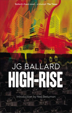
I really enjoy both of these covers. The one on the left is a more recent edition, and I love the oddly psychadelic colour scheme employed in the top half of the cover, the contrast of this to the darker bottom half really helps to emphasise the high-rise complex as the bright, shiny, attractive prospect compared to the dull, grey monotony of the houses, the typical suburban dwelling, on the bottom half of the cover. Likewise, the positioning of the high-rise complex illustrates how this sort of building towers over the skyline, dominating the cover and immediately drawing the eye/attention of anyone who looks at it.
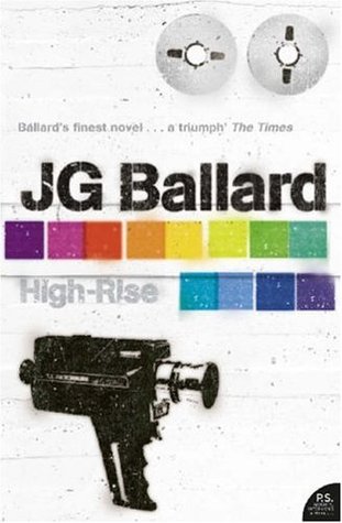
The one on the right is the copy I own – not that I actually had a wide variety of covers/editions to choose from! In contrast to the other example, I appreciate the simplicity of the stencil-like images of the film camera, something which is used by a resident called Wilder to document the goings-on in the high rise, and symbolises both the surveillance of residents and the mediation which film presents, recording action and presenting it in a narrative that might not necessarily “show” the whole picture. Ballard’s other books have also been produced in a similar design – with the grey background and blocks of colour as key design features carried across to the author’s other novels.
Favourite Cover – published by Flamingo (2003), Elsinore (2015)

I am a very indecisive person so, unsurprisingly, I couldn’t pick just one favourite cover, but I’ll try to keep my gushing to a minimum. First up is an edition published by Flamingo that I’d like to give an honourable mention to due to its deviation from the pattern every other cover has followed – it does not show the building. Instead, it opts to tap into the theme of luxurious and hedonistic partying which the building’s wealthier residents take part in, illustrating this through the image of a cocktail shaker. The potentially sinister nature of this is hinted, however, in the leaking pool of red liquid which the glass sits on, suggesting bloodshed is contained within the novel, amidst all the frivolous and carefree fun.
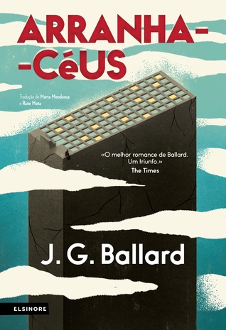
The second example I wish to showcase is the Portuguese edition published by Elsinore. In this design the building is much more minimalist in its façade, but the same destruction is suggested by the very visible cracks in the building. This feeds into the political and class-based undertones of the novel, suggesting the class-based foundation of this “building” (i.e. society) is ultimately fractured, and liable to crack entirely. The tiny figure sat atop the building also depicts, I believe, the protagonist, perched atop the building and so in a position of authority as he’s higher/above, able to oversee the action, as is expected from his role as the narrative’s protagonist. Most importantly, though, this status doesn’t come without the suggestion of threat, since his feet also dangle perilously over the edge of a very tall building which climbs high into the clouds. In this way the cover suggests the potential for an individual to “fall”, literally and metaphorically, both of which are considered in the course of the book.
Least Favourite Cover – published by Triad/Panther, 1977
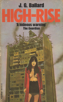 I can say, without hesitation, that this is my least favourite cover, perhaps ever. The use of the almost-but-not-quite exposed breasts in the only character on the cover seems unnecessary, done for mere eye candy, rather than to display something interesting about the plot – you’ll note there’s no sign of a man nearby in similar state of undress, though both happen during the course of the novel. If this kind of imagery must be used, I think a much more subtle approach could be used!
So there we have it, my very first Book Travelling Thursdays and I really enjoyed the chance to scrutinise some covers for a book I greatly enjoyed! What do you think of these covers? Which is your favourite?
Useful Links about High Rise:
