 Welcome one, welcome all, to ‘Emma Remembers Top 5 Wednesdays Exists And Decides To Join In’… again. Top 5 Wednesday is a weekly meme/challenge which was created by the wonderful Lainey from gingereadslainey and is now overseen by the equally lovely Sam from Thoughts of Tomes. Every Wednesday, participants devise their Top 5 based on a given topic.
This Wednesday’s topic is Books With Inaccurate Covers, covers that have nothing to do with the story or are just plain misleading or a really tacky cover for an otherwise great read. Since I read YA fantasy, that particular genre can occasionally fall foul of cover designers. If I see one more cover that’s ‘the girl in the dress looking over her shoulder’, I may very well scream. It’s such a shame because the stories inside the covers are often very compelling, but I know some readers will be put off ever picking the book up simply because of a cheesy cover. Likewise, I know some books with covers that are just completely misleading as to what genre they actually are, which is equally disappointing.
5. The Improbability of Love by Hannah Rothschild (x)
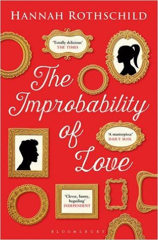 Don’t get me wrong, the UK cover for The Improbability of Love is a very beautiful cover. I love the red colour, the font of the title is fitting, and the picture frames hint at the importance of paintings to the overall story line. However, I feel like the cover is extremely misleading. It makes it look like it’s a simple story of ‘boy meets girl’, as suggested by the silhouettes, and as such the cover places it in a genre which is completely inaccurate. It makes it seem like it is just a contemporary novel, whereas it straddles the line between historical fiction and a little bit of fantasy, I guess? What genre would you call a story which features a painting that is personified and has opinions on its own story?
4. The Dark Days Club by Alison Goodman (x)
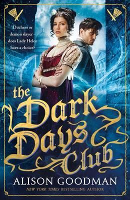 I adored The Dark Days Club but, let’s face it, the UK cover is cheese central. Whilst I don’t think the images of the main characters are too inaccurate (well, not compared to other examples of people on covers), I do think that the US cover is vastly superior mostly by virtue of not featuring discernible people on the cover. I’m not sure I understand the font choice either, or the colour scheme. The blue is very striking, admittedly, but the gold of the font just makes for a tacky combination. In comparison, the US version looks a lot more classy.
3. This Savage Song by V.E. Schwab (x)
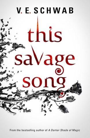 I adore Victoria’s books. And, for the most part, I adore the covers her books have been blessed with. For example both the UK and US editions of her Shades of Magic series are absolutely gorgeous. However, when it comes to This Savage Song, the US cover design is SO much better. Why? Because it’s beautiful and actually features an urban dystopian-y background image and a violin (relevant to the story, but no spoilers here) is the main focus of the design. Meanwhile this UK edition simply looks like a Twilight-esque story, no thanks to the font choice. Not sure I understand the relevance of the rose shattering either. Still, the story inside it is pretty damn good, it’s just a shame people might be put off by the cover.
2. The Winner’s Curse by Marie Rutkoski (x)
 Ah, the curse of the girl in the dress strikes again! I don’t know why on earth the design team decided on this image. The story is about so much more than just the typical YA heroine in the dress. I’m sure Kestrel may well own a dress and wear it on occasion but it really encompasses nothing else of the story. One thing I do really like is the use of the font on the cover overlaying the image and it appearing vertically instead of horizontally, I think that’s a great way of drawing the eye to the book, but I do still think it’s an extremely inaccurate design. Mind you: the alternative new cover is definitely not better.
1. The Queen of the Tearling by Erika Johansen (x)
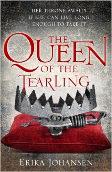 The Queen of the Tearling has featured in a previous Book Travelling Thursday post of mine when I elucidated, at length, why I hate this cover. Once again, the US cover is much more preferable, and I wish I could get my hands on a US hardcover copy of this book because it fits the darker, more gritty tone of the story a lot more than this one does. Mind you, the symbolism of the bear trap placed ceremonially like a crown on a pillow is an amazing idea for cover design… I just wish it had been done in a bit more of a fancy fashion since I think this cover makes the story seem a bit childish, which it is most definitely not!
So there we have it – those were the top 5 books that I reckon have some inaccurate covers.
Do you agree/disagree with my choices? Do you have a Top 5 Wednesday list or post of your own? Be sure to link it below if so; I’d love to take a look!
Goodreads | Twitter | Tumblr | Instagram | Bloglovin’

2 responses to “T5W | Inaccurate Book Covers”
The Winners Curse cover definitely is misleading, it just isn’t very Kestrel. I agree that the new ones aren’t better either. Great list!:)
LikeLike
Thank you! Yeah I think The Winner’s Curse covers are quite bad, so misleading, and they will definitely put people off reading them – I almost didn’t pick them up because of it. :P
LikeLiked by 1 person